LOGO DESIN
Typeography
BRAND IDENTITY
GRID SYSTEMS
FARRAR-NICHOLS ASSOCIATES

THE INTERSECTION OF LOGIC AND LANGUAGE
Client
Farrar-Nicholes Associates
Industry
Publishing & Editing
Service
Brand Identity, Logo Design
Designer
Matias Levi
INITIAL CONCEPTS
01
REFINEMENT
02

Early exploration focused on integrating the initials 'F', 'N', and 'A' directly into the crossword grid. I experimented with various densities of black and white squares, seeking a balance between legibility and the iconic visual language of a puzzle. The goal was to create a mark that felt both solved and solvable.

FROM SKETCH TO VECTOR
Refining the chosen concept required precise geometric adjustments. I moved from loose sketches to a strict grid system, ensuring that the spacing between the letterforms and the containing blocks was mathematically consistent. The diagonal arrangement was introduced to create dynamic movement within the static grid.
DESIGN EVOLUTION

A chronological view of the logo's development, from the blank canvas of the initial idea to the polished, geometric final form.


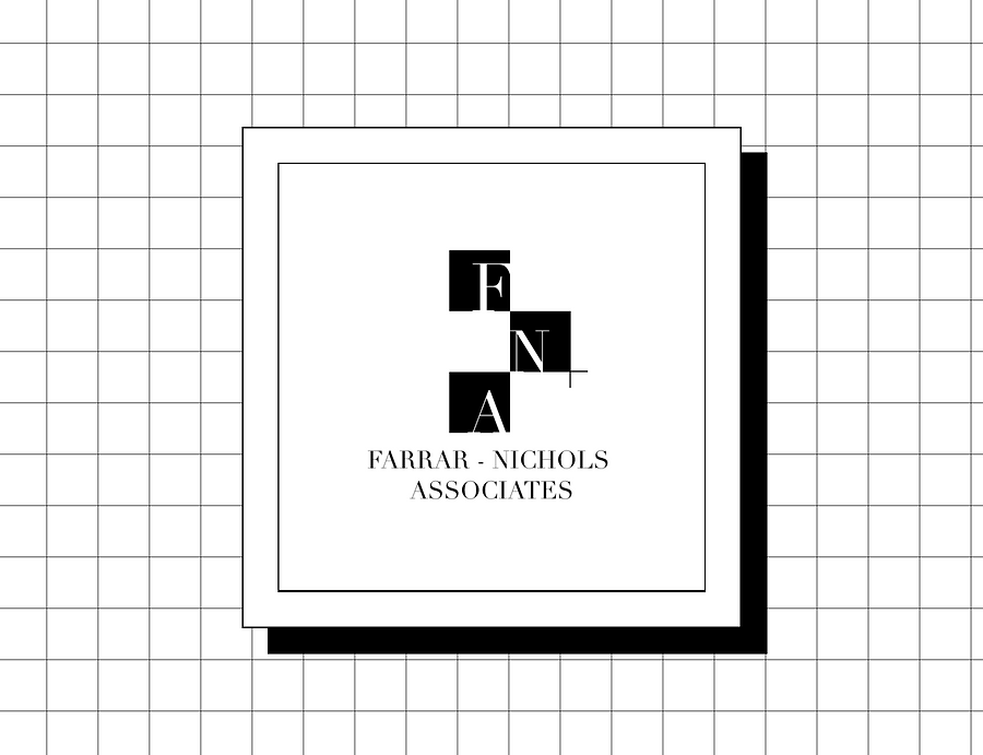
THE PRIMARY MOCKUP
The primary mark features solid black blocks with white reversed-out typography, creating maximum contrast and immediate recognition at small sizes.
LINEAR VARIATION
A secondary, skeletal version uses outlines instead of solid fills, suitable for applications where ink density is a concern or a lighter aesthetic is required.
VERTICAL STACK
The vertical orientation accommodates narrow formats, maintaining the structural integrity of the grid while allowing the full name to be legible.

"A good puzzle is a conversation between the constructor and the solver. The design must invite that dialogue."
The final identity for Farrar-Nichols Associates goes beyond just a logo; it serves as a visual statement of their craft. Using the visual language of crossword puzzles, the high-contrast grid, serif typography, and the organized chaos of black-and-white squares, I’ve helped create a brand that feels genuine, authoritative, and deeply connected to the world of wordplay. The result is timeless, purely geometric, and simply elegant.
